
The Daily Shot: 08-Jun-20
• The United States
• Canada
• The Eurozone
• Japan
• China
• Emerging Markets
• Commodities
• Energy
• Equities
• Credit
• Rates
• Food for Thought
The United States
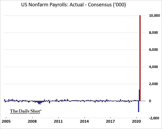
1. Let’s begin with the May employment report, which was far stronger than the consensus estimate.
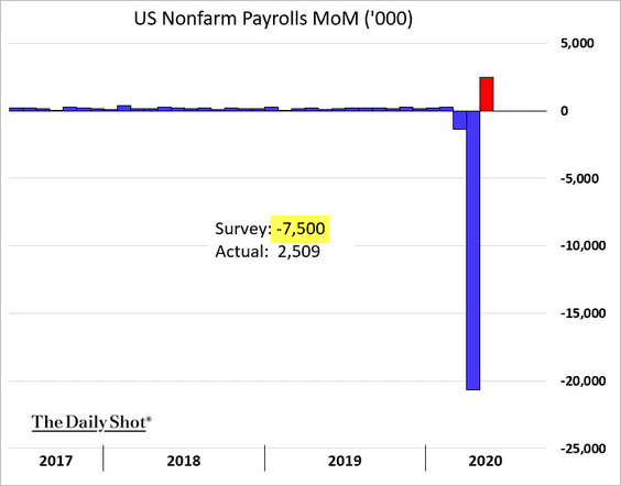
The gap between the forecast and the actual payrolls reported by the Labor Department was the largest on record (a 10 million gap).
 Source: MarketWatch Read full article
 Source: Bloomberg
While there are numerous theories as to why economists were so far off, one explanation was widely discussed on Friday. The jobless claims data and the ADP private payrolls report did not pick up what analysts call “hidden hiring.” Firms put their employees on “government payroll” for a couple of months with full intentions of bringing them back. Here is a summary from Ian Shepherdson, Pantheon Macroeconomics.
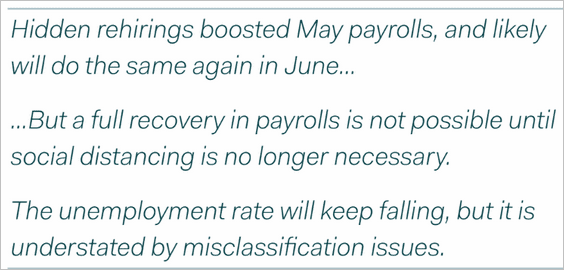 Source: Ian Shepherdson, Pantheon Macroeconomics
This gradual rehiring can be seen in the Homebase small business data.
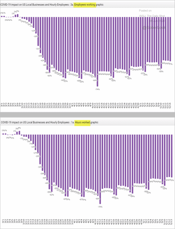 Source: Homebase
Of course, assessing the employment situation in this environment can be hellish (see story).
——————–
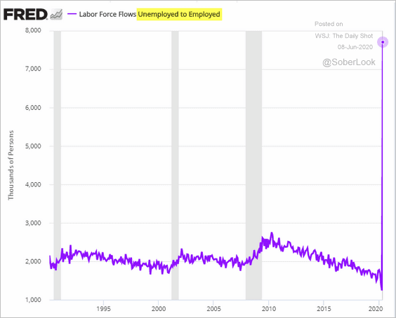
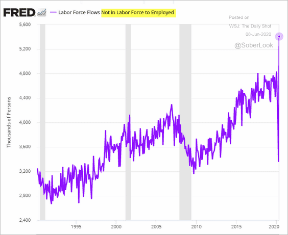
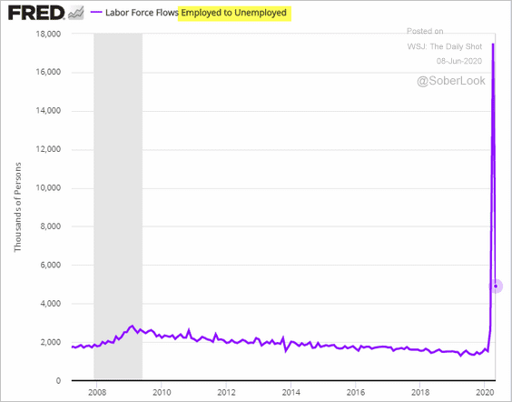
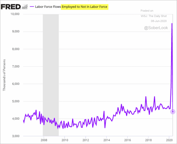
Let’s take a look at the labor force flows data.
• Here is the rehiring wave.
– Flows from “unemployed” to “employed”:
– “Not in labor force” to “employed” (these folks either didn’t qualify for unemployment benefits or their claims were delayed):
• Layoffs have slowed.
– “Employed” to “unemployed”:
– “Employed” to “not in labor force:”
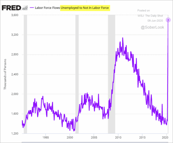
• At the same time, flows from “unemployed” to “not in labor force” hit a record high.
• Here are the workers that were classified as “not in the labor force” but are now counted as unemployed (probably due to the massive backlog in unemployment applications).
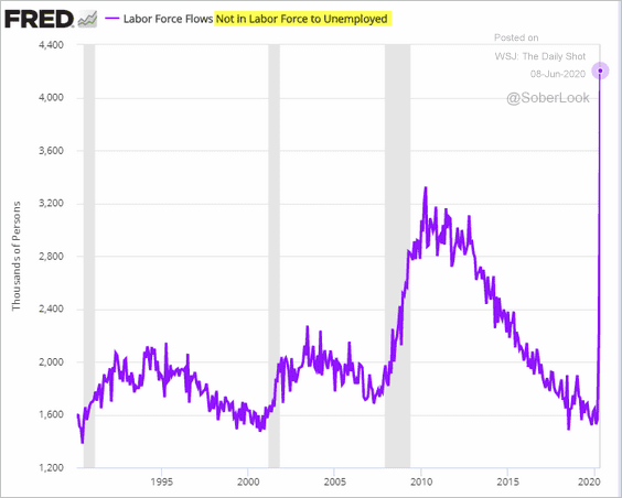
It will be a while before economists can fully make sense of the current labor market dynamics, and research papers will be written on this for years to come.
——————–
Next, we have a number of other results from the jobs report.
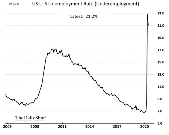
• Underemployment (U-6)
• Not in the labor force but want a job:
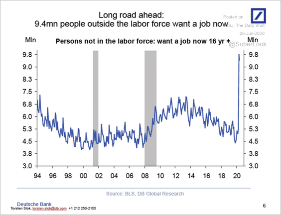 Source: Deutsche Bank Research
• The employment-to-population ratio:
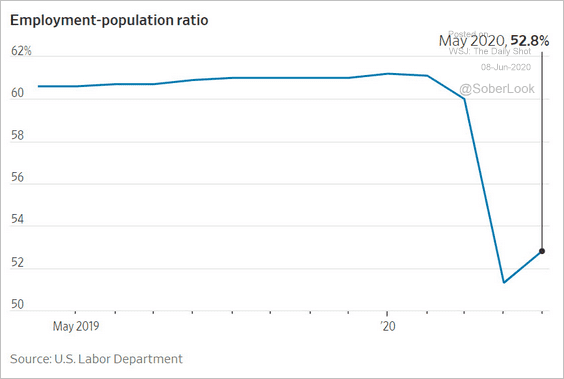 Source: @WSJ Read full article
• The employment diffusion index:
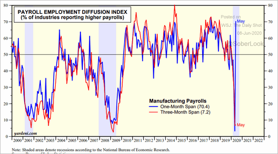 Source: Yardeni Research
• Reasons for unemployment:
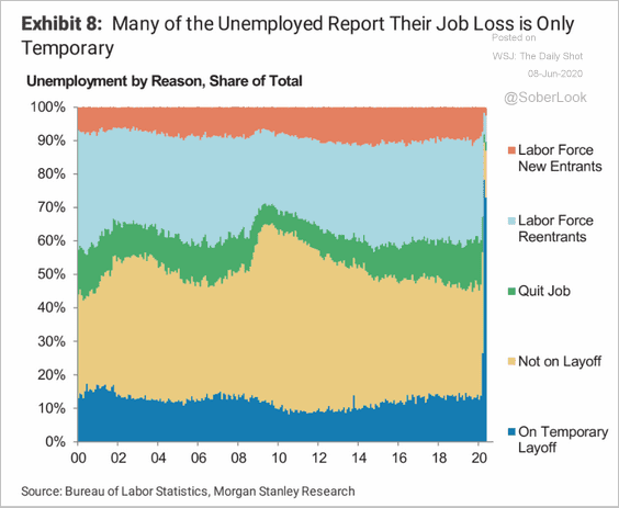 Source: Morgan Stanley Research
• Job gains/losses by sector (3 charts):
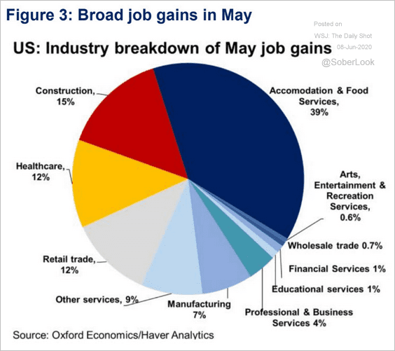 Source: Oxford Economics Read full article
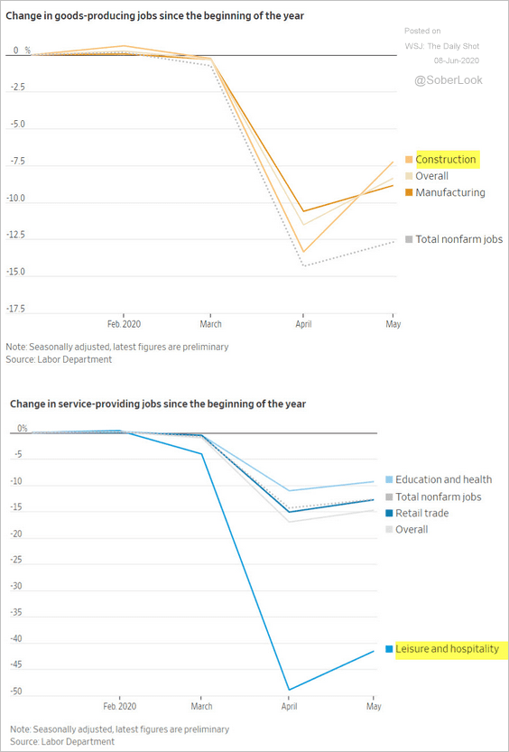 Source: @WSJ Read full article
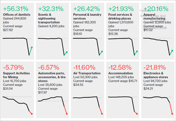 Source: @bbgvisualdata Read full article
We’ll have more data on the labor market tomorrow.
——————–
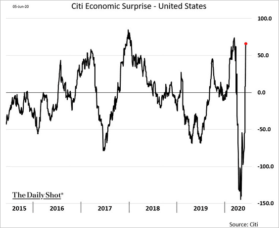
2. The Citi Economic Surprise index spiked as a result of the jobs report.
3. Below are some updates on inflation.
• Nomura expects another core CPI decline in May.
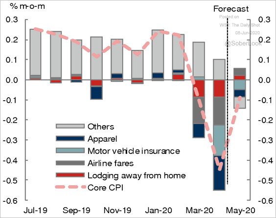 Source: Nomura Securities
• Food CPI probably rose sharply.
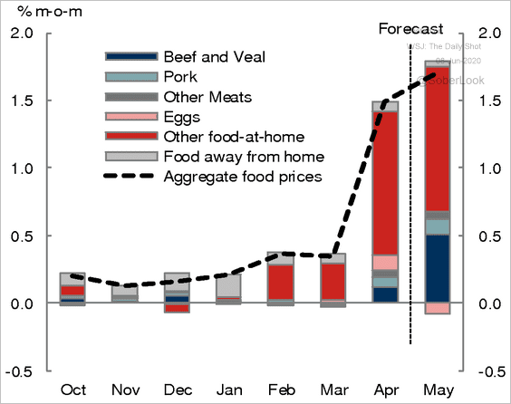 Source: Nomura Securities
• Market-based inflation expectations are recovering.
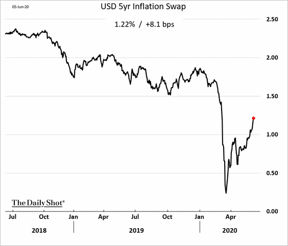 Source: Bloomberg
——————–
4. Consumer credit collapsed in April, driven by credit cards (revolving credit).
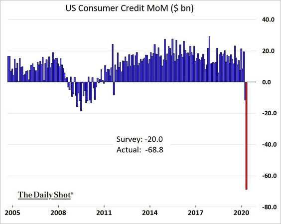
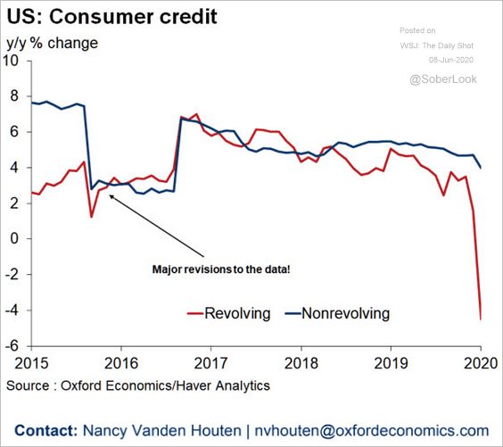 Source: Oxford Economics
——————–
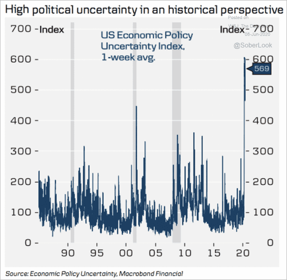
5. Economic policy uncertainty remains highly elevated.
 Source: Danske Bank
Canada
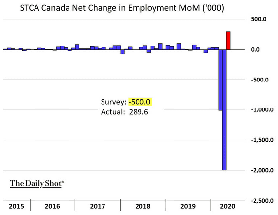
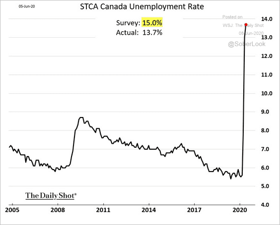
1. Similar to the US, “hidden hiring” surprised forecasters. Almost 300k jobs were added on a net basis, while the market expected a half a million loss.
• The unemployment rate rose less than expected but still hit the highest level in recent history.
 Source: Oxford Economics Read full article
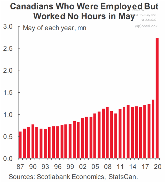
• This chart shows the number of workers who are employed but haven’t worked in May.
 Source: Scotiabank Economics
——————–
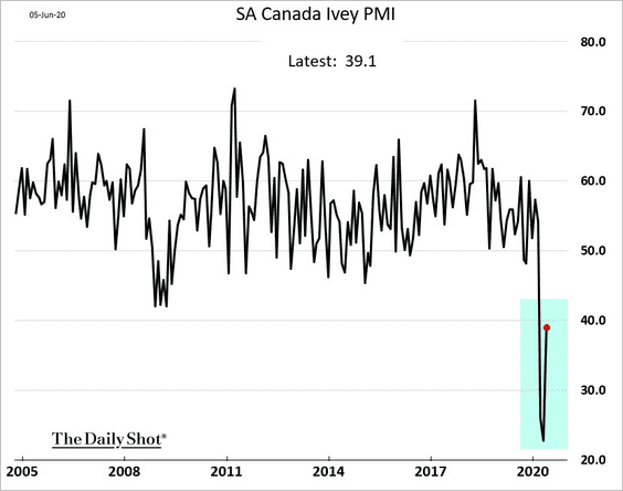
2. Business activity started stabilizing in May.
3. Canada’s trade tumbled in April.
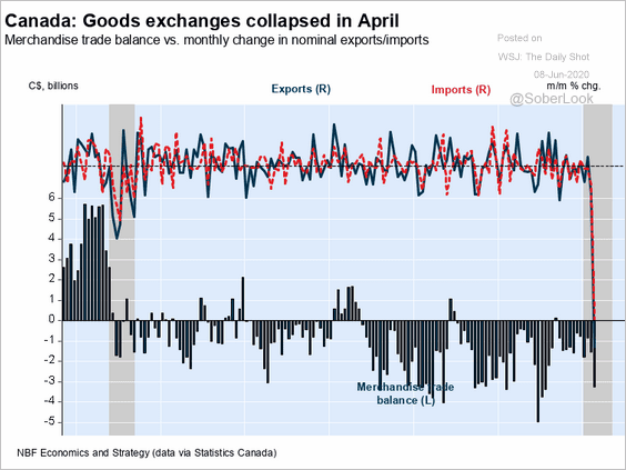 Source: Economics and Strategy Group, National Bank of Canada
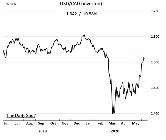
4. The loonie rebound continues.
The Eurozone
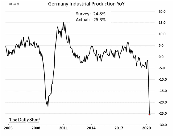
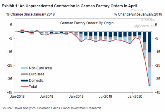
1. Germany’s factory orders, industrial production crashed in April.

This chart shows the components of factory orders.
 Source: Goldman Sachs
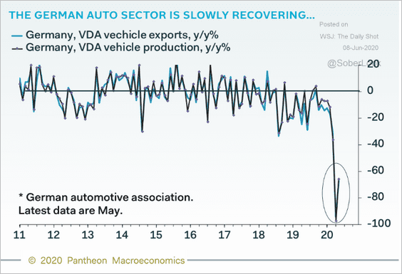
But industrial activity started picking up from extreme lows in May.
 Source: Pantheon Macroeconomics
——————–
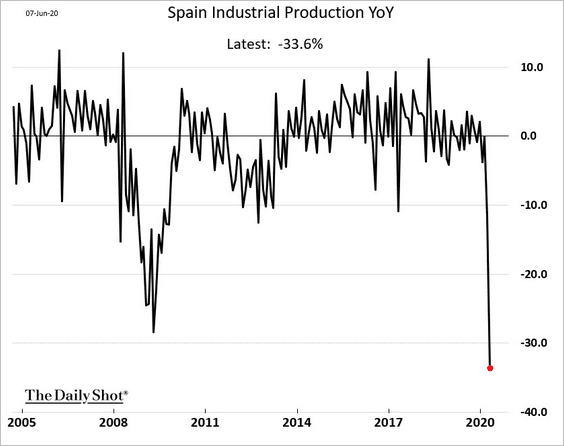
2. Spain’s industrial production also registered the worst decline in recent history (data through April).
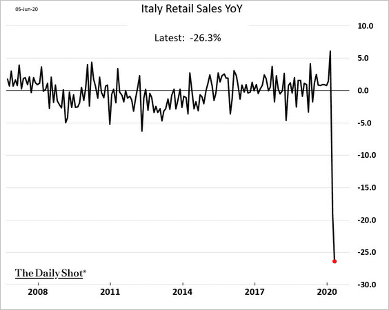
3. This chart shows the year-over-year changes in Italian retail sales (data through April).
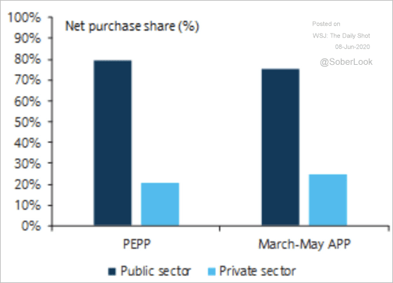
4. Below is the breakdown of the ECB’s QE purchases in the public and private sectors.
 Source: Barclays Research
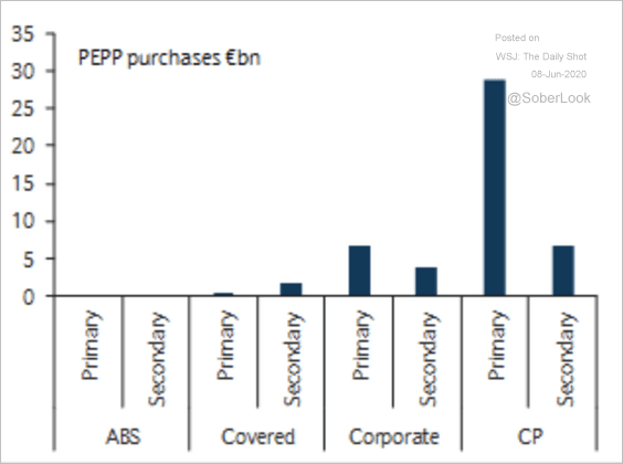
Private sector PEPP purchases have focused on commercial paper, especially in the primary market.
 Source: Barclays Research
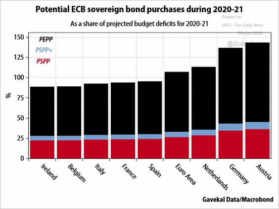
This chart from Gavekal shows potential ECB bond purchases relative to each nation’s projected budget deficit.
 Source: Gavekal
Japan
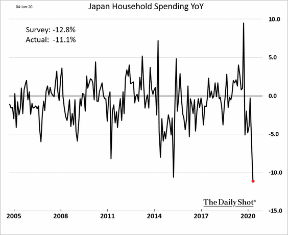
1. Household spending tumbled in April.
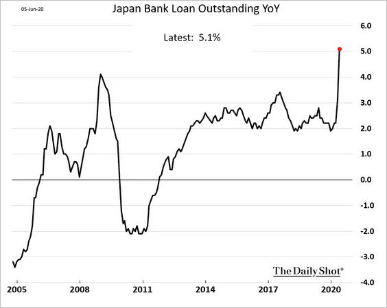
2. With companies raising cash, loan growth jumped in May.
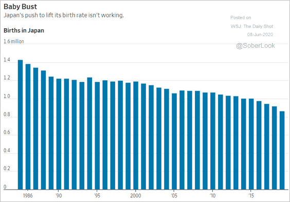
3. Japan’s births continue to slow.
 Source: @WSJ Read full article
China
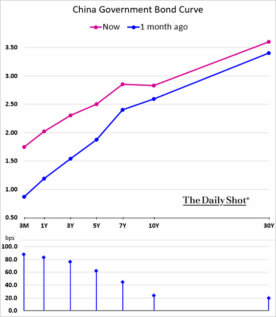
1. The yield curve has been flattening.
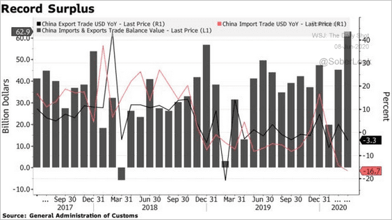
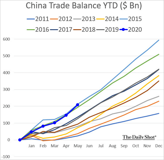
2. China’s trade surplus jumped, as imports weakened (2nd chart).
 Source: @markets Read full article
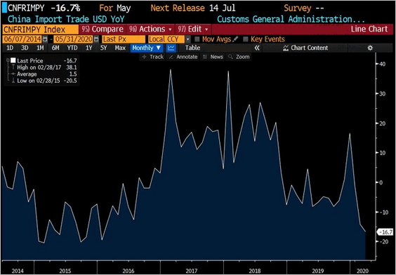 Source: @TeddyVallee
On a year-to-date basis, China’s trade surplus is roughly at 2015 levels.
Emerging Markets
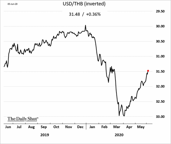
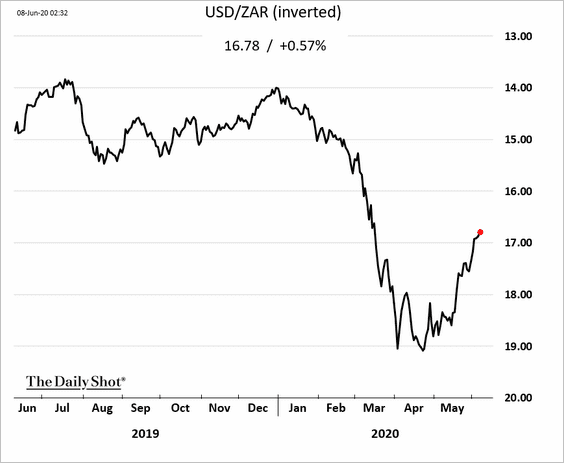
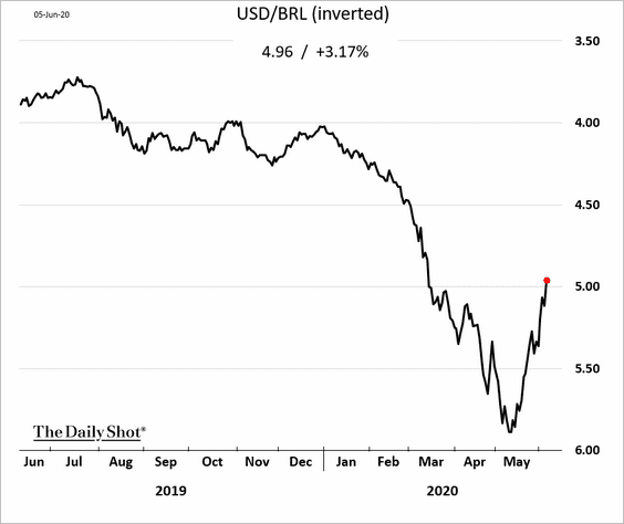
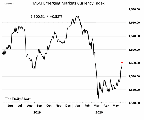
1. The rebound in EM currencies continues as risk appetite returns
• The Thai baht:
• The South African rand:
• The Brezilian real:
• The MSCI EM Currency Index:
——————–
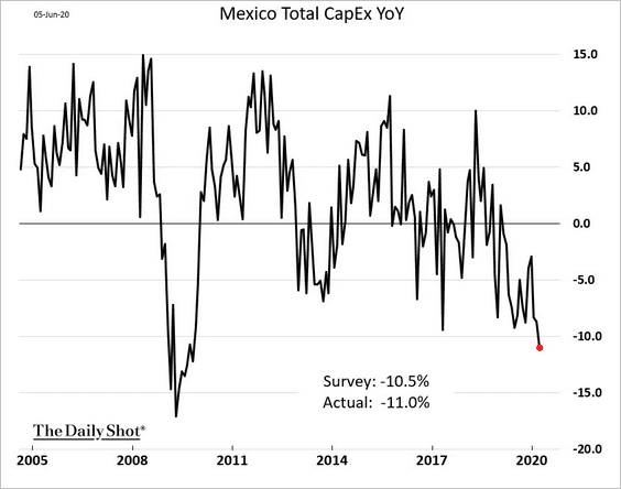
2. Mexico’s CapEx was already tumbling in March.
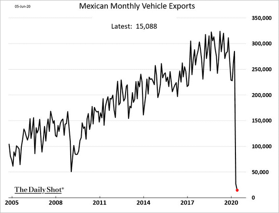
May vehicle exports were almost nonexistent.
——————–
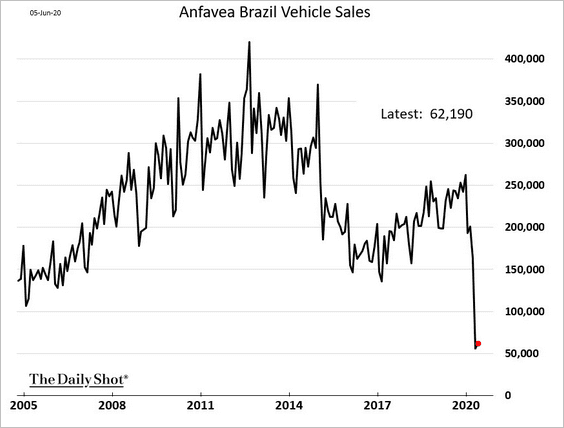
3. Brazil’s vehicle sales remain near multi-year lows.
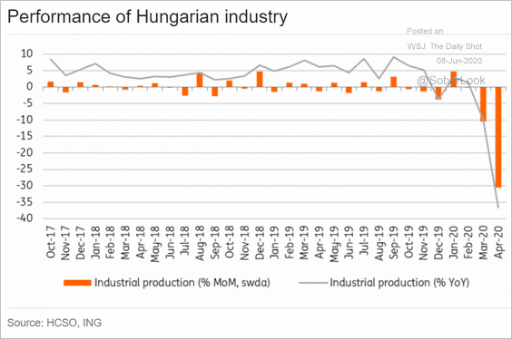
4. Hungarian industrial output plummetted in April.
 Source: ING
Commodities
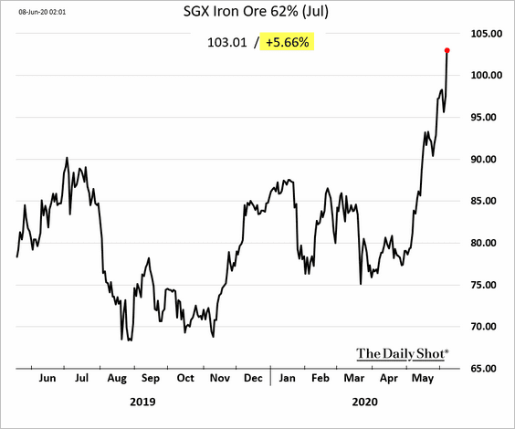
1. Iron ore prices are soaring.
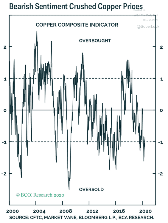
2. Copper is still deeply oversold, according to BCA Research.
 Source: BCA Research
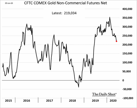
3. Speculative bets on gold are moderating.
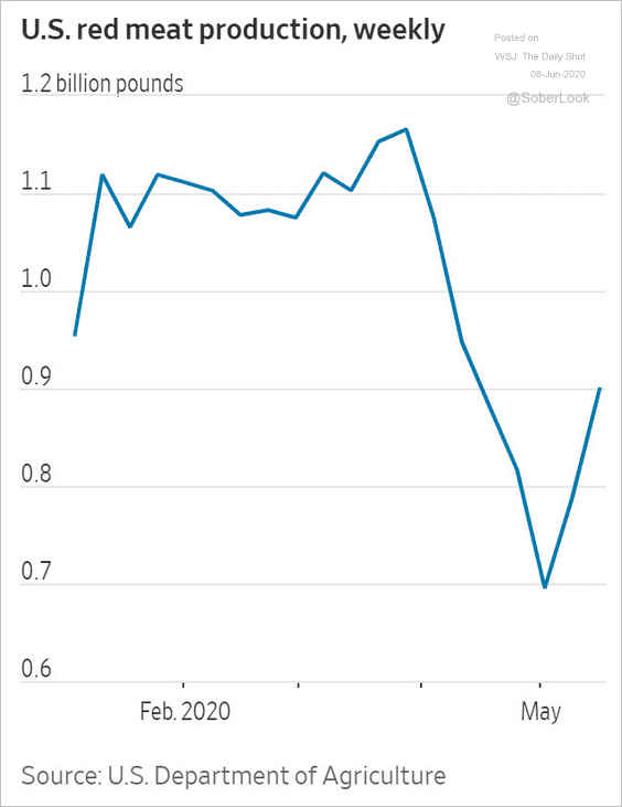
4. US meat prices are declining from the recent highs, as production picks up (2nd chart).
 Source: @WSJ Read full article
 Source: @WSJ Read full article
Energy
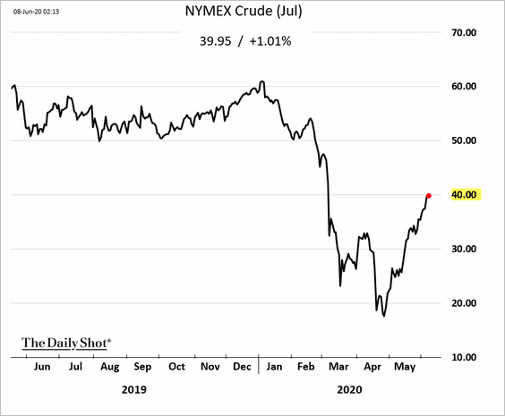
1. The July NYMEX crude oil futures contract is near $40/bbl.
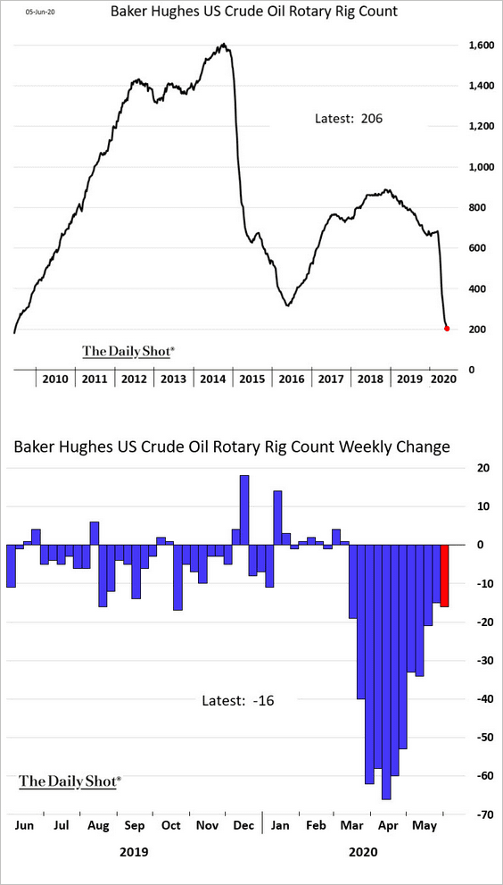
2. The US rig count is approaching 200 for the first time since 2009.
3. US refinery inputs are gradually recovering.
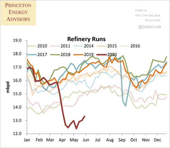 Source: Princeton Energy Advisors
4. While gasoline demand has been improving, the total product supplied has weakened again.
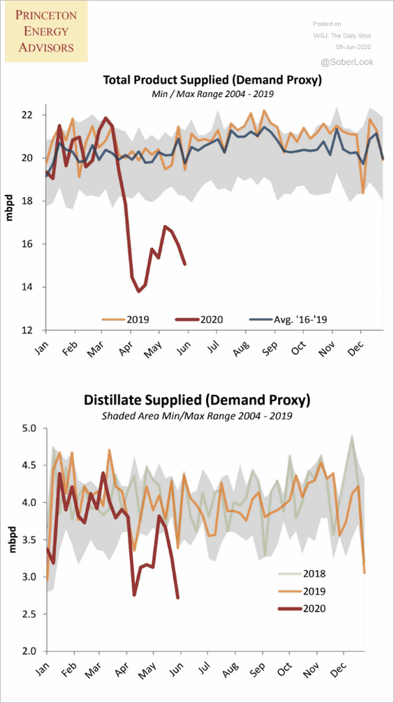 Source: Princeton Energy Advisors
5. Oil prices are catching up with energy shares.
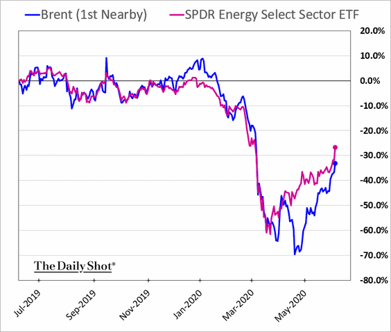 h/t Namitha Jagadeesh
Equities
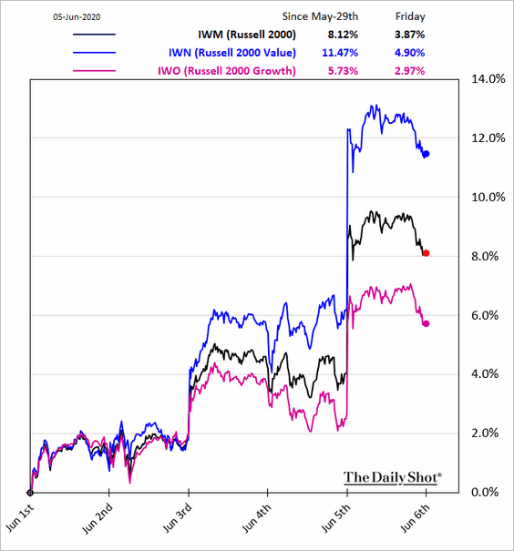
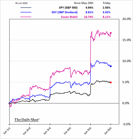
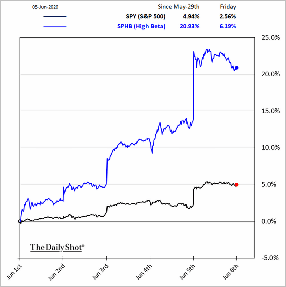
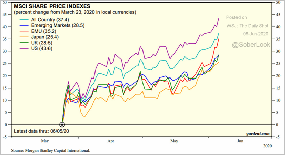
1. Friday was a good day for beaten-down stocks.
• Large-cap value:
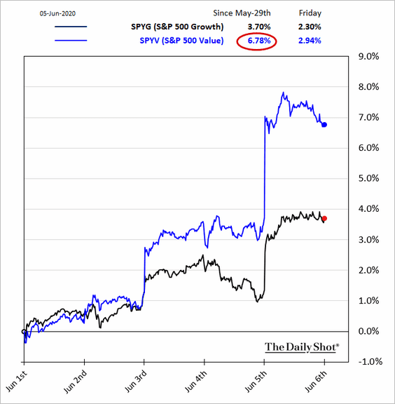
• Small caps:
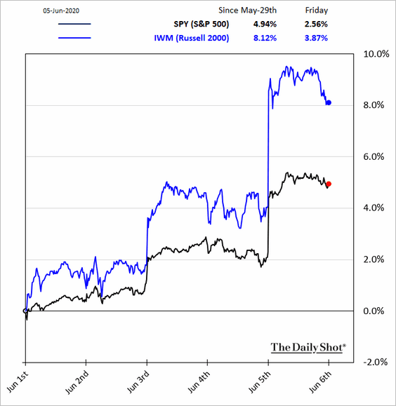
• Small-cap value:
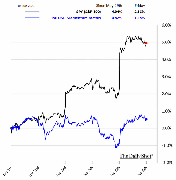
On the other hand, momentum shares underperformed (2 charts).
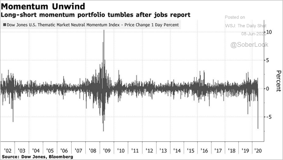 Source: @markets Read full article
Here are a couple of other equity factor charts.
• High-dividend stocks (boosted by energy):
• High-beta:
——————–
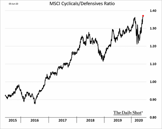
2. The cyclicals/defensives ratio is back at multi-year highs.
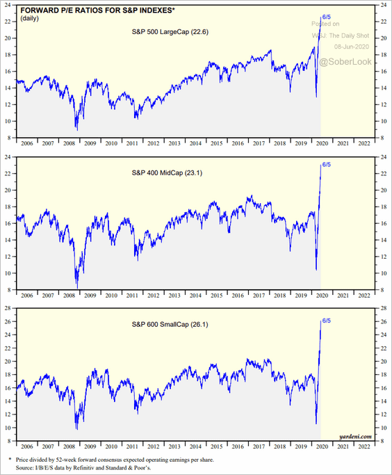
3. The market continues to ignore the 1yr forward P/E ratios, as investors bet on a V-shaped recovery (S&P 600 = small caps, S&P 400 = mid-caps).
 Source: Yardeni Research
This chart shows the forward P/E ratio for equity markets around the world.
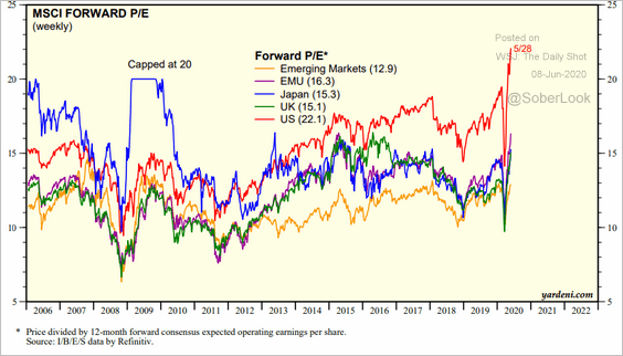 Source: Yardeni Research
——————–
4. The US recent outperformance vs. other developed markets has been remarkable.
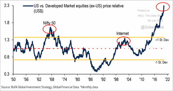 Source: BofA Merrill Lynch Global Research
 Source: Yardeni Research
——————–
5. Outperforming 1929?
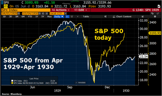 Source: @Schuldensuehner Further reading
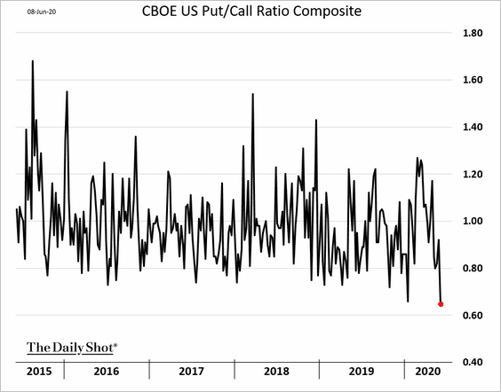
6. The put/call ratio is near multi-year lows.
Credit
Inflows into corporate credit funds have been robust.
• Investment-grade:
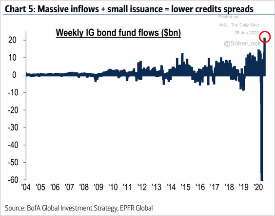 Source: BofA Merrill Lynch Global Research
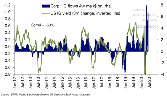 Source: Deutsche Bank Research
• High-yield:
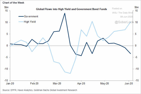 Source: Goldman Sachs
Rates
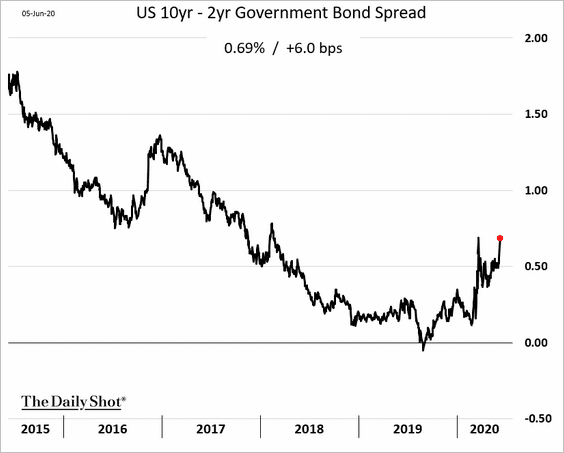
1. The Treasury curve has been steepening.
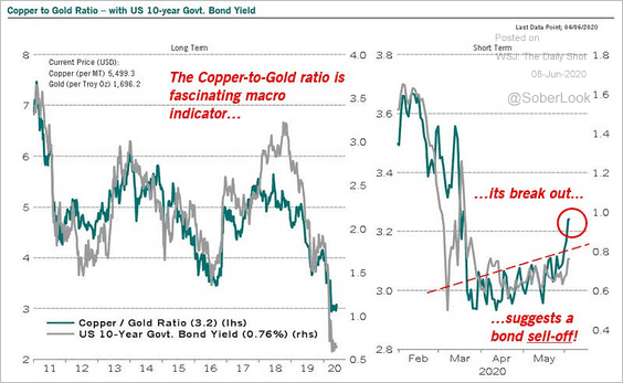
2. The copper-to-gold ratio points to higher bond yields.
 Source: @RichardDias_CFA, @ISABELNET_SA
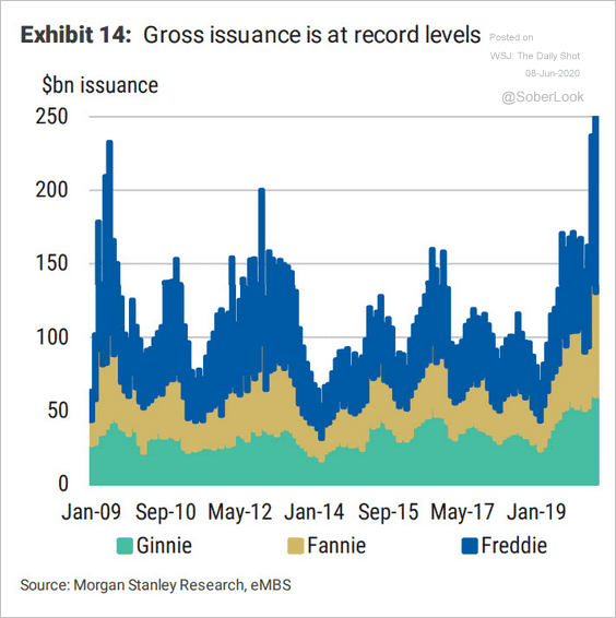
3. Gross residential MBS issuance spiked amid a wave of refinancing and robust home-purchase applications.
 Source: Morgan Stanley Research
Food for Thought
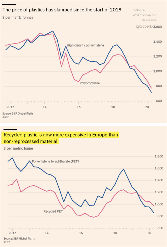
1. The price of plastics:
 Source: @financialtimes Read full article
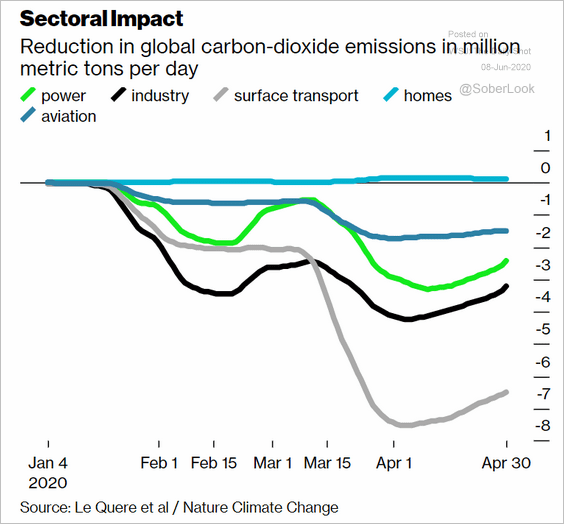
2. CO2 declines by sector:
 Source: @business Read full article
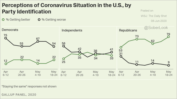
3. Is the coronavirus situation getting better?
 Source: Gallup Read full article
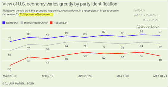
4. Is the US economy in recession?
 Source: Gallup Read full article
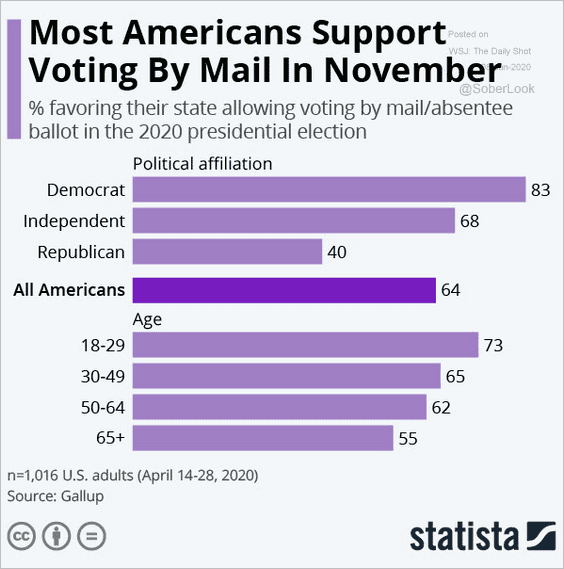
5. Voting by mail:
 Source: Statista
6. Police shootings:
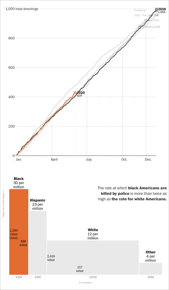 Source: The Washington Post Read full article
7. Projections for the automobile market:
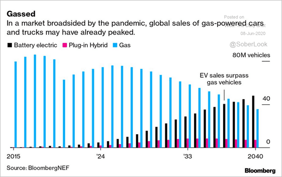 Source: @business Read full article
8. Preferences for streaming services:
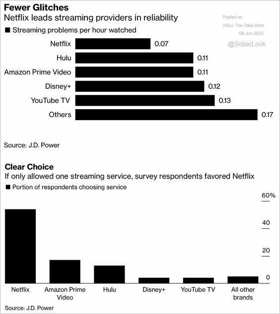 Source: J.D. Power, @technology Read full article
9. Spending on luxury goods by region:
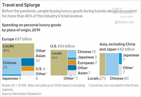 Source: @WSJ Read full article
——————–